
Gnarls Barkley's début album St. Elsewhere peaked at number 1 on the UK album chart on it's release April 24th 2006 and on the US Billboard 200, peaked at number 4 after being released May 9th 2006. The first single, "crazy" was a phenomenon and became the first song to become a UK number 1 single purely by digital downloads. Sales by March 15 2007 were 1,260,535 copies, making the album receive platinum certification. Despite St. Elsewhere originally being named, 'Who Cares?' due to the predicted failure to generate high sales, the album has sold over 5.8 million copies internationally!
The images shown on the front of the cover are abstract and don't show the artist's face. There is a presentation on an explosion which suggests an alarming feel to the music. The images shown are contemporary and colourful which reflect on the type of music being promoted. The contrast of images against a grey background creates the idea that the sbujects are breaking out from a bleak environment. The sillouete image of the city seems to be the anchoring image in which all the other images reflect, suggesting that there are connotions of the city environment. The typography of the album is located on the right side of the images; by doing this it gives the impression of the music being center stage, instead of the artist. The capital font however creates a sense of importance and also anchors the city theme as it conotes west end advertising and show.B.O.B Presents - The Adventures of Bobby Ray

B.o.B Presents: The Adventures of Bobby Ray is the début album by artist B.o.B which was released April 27, 2010. In it's first week of release it sold 84,000 copies. B.o.B Presents: The Adventures of Bobby Ray debuted at number one on the US Billboard 200 chart and had a peak position of 22 on the UK albums chart. The album currently has two singles that have achieved high international chart success, "Nothin' on you" and "Air planes."
The use of CGI along with the artist being shown on the album cover helps the audience realise who created the music. The body shape taken up by the artist makes him look like an action man which would suggest his music is powerful and maybe even experimental. The effect of the large rocks surrounding the artist and the ring of fire create an explosion like look which enhances the presence of the subject. This is anchored with the typography which in itself provokes a sense of exploration and cartoon like fantasy because of the bold font with letters made to look like they have been stretched and are heading in a certain direction. The background appears to be in space which would suggest an out of world experience attempted to be obtained by the artist. The artist is wearing clothes that in the contemporary day would be very socially acceptable; the outfit wouldn't alienate many audiences so therefore doesn't present a particular target audience. The complexity and visual clutter of the album cover suggests that the artist has put in a lot of time into having it completed which may reflect on the quality of music, however it could be argued that the need to have an outstanding CD cover maybe because the artist name is not yet established enough to attract audiences in a minimalist way.
Lil Wayne - Tha Carter III
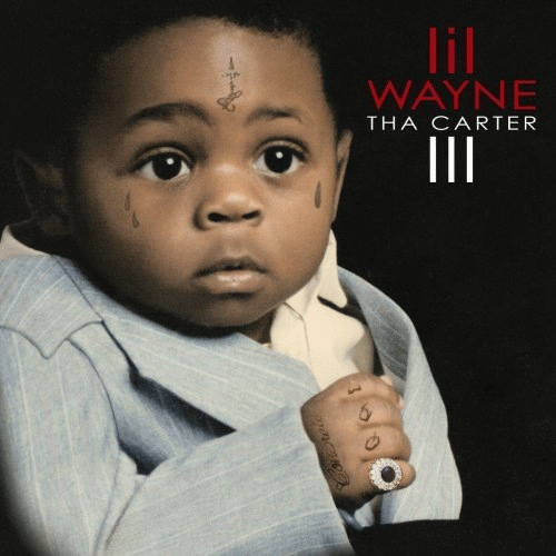
Tha Carter III, released 10th of June 2008 recieved great admiration after a huge period of antipation. The album sold 1,005,545 copies in its first week and 2.88 million by the end of the year, producing 4 chart toppers on the US Billbord 200. Lil Wayne's album earned a grammy for bes rap album above 7 other awards and since then has gone tripple platinum.
The cover features Wayne as a baby; the effect of doing this may reflect the artist as a sentimental and personal person, as he allows audiences to see what he used to look like at an innocent and fragile age. However the inclusion of the tatoos with the expencive looking ring and blue pinstripe suit may connote how the artist has always been in the rap buisness and maybe even promoting himself as a prodigy. These tatoos may also have the effect of targeting an audience, as they could have been done as a representation of an area or lifestyle. I think this use of subliminal messaging is an effective way of attracting a niche audience as it is only recocgnised by the true fans. The use of white space means there is little distraction of the baby Wayne and the typography, by doing this there is little confusion and may represent how the artist has nothing to hide so can be centre stage. The typography has a sharp buisness like style that anchors the featured picture, this could reflect how the artist has created the music with a formal mentality. The artist name is split from the album name via font colour instead of size, by doing this there is less of an idea that Lil Wayne is bigger than his music or vice versa.
Daniel Merriweather - Love and war

Love & War is the second album by Daniel Merriweather, released in the UK on the 1st June 2009 and the 23rd February 2010 in the US. "Change" and "Red" were singles off the album which made it into the UK top 10 singles chart and helped Love & War peak to 2nd on the UK albums chart. The album generated 43,000 sales in the first week of release.
The image shown of the artist has made to look more natural, by doing this it presents Daniel Merriweather in his own element and comfortable in what he is doing. There is a colour theme of grey and black that is used both in the artists clothing and the typography which suggests an influence from the street and an urban lifestyle. This is further anchored by the subject being next to a street. The font, that resembles 'Bondi MT black' and 'Carbon block' provides an almost stencil like effect within a label that gives a highlighting effect. The effect of the label above the artists head instantly pins him to the name and therefore helps the artist become more prolific. The body composition of the artist makes him look like his back is turned from the streets which may signify an attempt to change attitudes. The effect of no white space on the album may cause audiences to be drawn into everything appearing on the cover, this visual cover means that the subject may not be as noticable. However the image of the open road may act as a different way of creating white space as it is empty.
Joss Stone - Introducing Joss Stone

'Introducing Joss Stone' is Joss Stone's third studio album, released in the UK 12th March 2007 by Relentless Records. From it's introduction to the U.S. Billboard 200 chart at #2 it sold 118,000 copies in the first week, this was the second-ever highest new entry for a British female solo artist on the chart to Leona Lewis' Spirit.
The album cover features a woman with graphics on her body laid on a wall. The graphics shown include bright reds pinks and greens, which anchor the peace symbol and love heart on her back and arm. By this being done it suggests a celebration and sense of freedom, this may reflect the style and feel of the music being un restricted and uplifting. Although exposed against the wall, the featured woman has kept a sense of intimacy by keeping her back to the wall and most of her face being obscured by her hair. With this in tact it could present the opportunity for the audience to experience a more private side of Joss Stone through her music. The skin colour of the the woman is similar to the wall she is pressed upon, so the inclusion of the graphics create a sense of individuality. The house colours of red and grey create a big contrast; this is explored in the way the artist name stands out against the wall. The way the name stands out creates an effective "introduction" of the artist and also doesn't take away attention from the image which suggests the artist is equal to the music she makes. The typography has a graffiti like look, an opinion enhanced as it is against the wall; because of this it continues the belief that the music being played is expressive and unconstrained.
Paramore - Riot!

Riot! is the second studio album by American Paramore, released in the U.S. June 12th 2007 peaking to 15th on the US Billboard 200. It was then released in the U.K. June 25th 2007 peaking to 24th on the UK albums chart. The album went Platinum in July 11th 2008.
There is the use of heavy visual clutter is achieved by the repeated "Riot!" word used. The typography reflects a hand written style; this design creates a personal effect which may encourage audiences to get to know the band in a private way. Although similar, the font's used are not all identical which may reflect on the varied emotions during the production of the music. The simplicity of the design idea may suggest that the band are not concerned with many things other than their music; this is anchored as the band name is placed subtly within the album name. As the band name is obscured it may also suggest how only dedicated fans will recognise the copy because they recognise the style of album cover. I think this feature of subtly placing an artist/band within the album cover is a good way of attracting a niche audience. The album cover could be said to resemble what someone would "scribble" down on a journal, so the effect of this could present audiences with a chance to enter the thoughts and feelings if the band through their music. The album name Riot! clearly has taken the majority of the cover and looking into the word riot, it carries connotations of wild and violent disorder as well as being unrestrained and loose living, features of which Paramore may want their audience to experience.
No comments:
Post a Comment